
Flyer Designs That Still Work in 2026
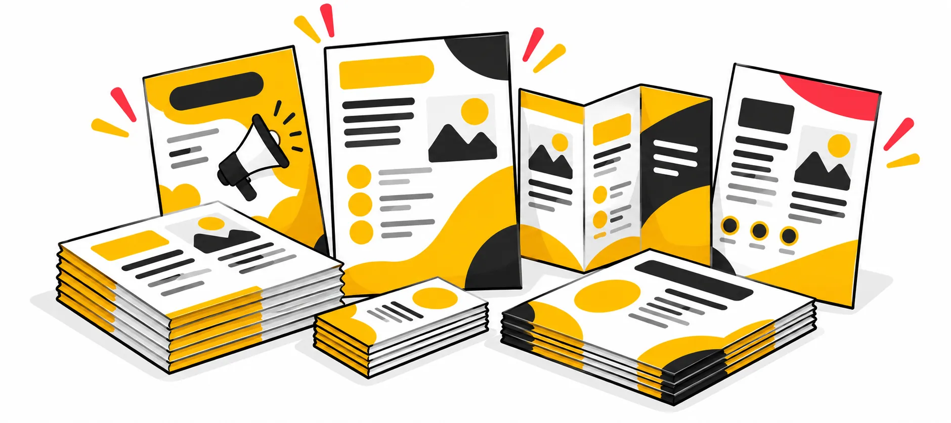
A practical guide for local businesses, marketers and anyone who still believes in the power of print.
Every few years, someone declares that print is dead. And every few years, the businesses handing out well-designed flyers at the right moment prove them wrong.
In 2026, flyer marketing is not competing with digital; it is complementing it. A great flyer does something a social media ad cannot: it lands in someone's hands, takes up physical space in the world and sticks around. Whether it is pinned to a community board, tucked under a windshield wiper or mailed directly to a neighbourhood, a printed piece is a tangible commitment to your message.
But not all flyers work. Cluttered layouts, forgettable visuals and missing calls to action waste both money and opportunity. This guide covers the flyer design principles, formats and modern techniques that make print marketing effective in 2026.
01 Why Flyers Still Earn Their Place in Your Marketing Mix
The case for printed materials is not nostalgia. It is neuroscience and economics.
Research in haptic memory shows that physical materials create stronger brand recall than digital ads. When someone holds a well-printed piece, feeling the weight of the paper, noticing the texture of a matte or gloss finish, that multisensory experience embeds the message more deeply than a scroll-past impression ever could.
From a cost perspective, flyer printing through a professional printing company is one of the most affordable options in small business marketing. For local businesses especially, a direct mail marketing campaign or a door-to-door distribution run can drive measurable foot traffic and leads at a fraction of what paid digital advertising costs per conversion.
Print also reaches people that online channels cannot: those who have ad blockers, those who are not active on the platforms where you advertise and those who simply respond better to holding something real.
The Haptic Advantage: Physical print materials engage touch and sight simultaneously. Cognitive research confirms that tangible marketing assets create deeper emotional processing and higher recall rates than transient digital banners.
02 The Anatomy of a Flyer That Actually Works
Effective flyer design comes down to structure, clarity and intent. Here is what every high-performing piece gets right:
1. A Single, Dominant Headline
Your headline is the first thing the eye lands on and the deciding factor in whether someone reads further. It should communicate one clear benefit or offer, not three. Keep it large, bold and direct. "50% Off All Services This Weekend" beats "Welcome to Our Spring Promotion Event" every time.
2. Visual Hierarchy That Guides the Reader
A good layout uses size, contrast and spacing to move the reader's eye from the most important element to the least. Any strong piece has three visual layers: headline, supporting information and call to action. Everything else is secondary. Overcrowding with equal-weight elements is one of the most common mistakes in print marketing.
3. Fonts That Are Readable at a Glance
The best typefaces for this format are clean, legible and on-brand. A bold sans-serif for headlines – Montserrat, Bebas Neue or similar – paired with a readable body font creates a professional, easy-to-scan layout. Avoid using more than two or three typefaces on a single piece; they fragment the visual experience and undermine consistency.
4. Colour That Works Hard
Colour psychology plays a real role in how people respond to marketing materials. Bright tones signal energy and urgency. Muted palettes suggest premium quality; deep, rich hues feel authoritative. Whatever you choose should align with your existing brand colours. Materials that look nothing like your other touchpoints fragment your identity and reduce recognition over time. High-contrast combinations also improve readability, particularly for pieces viewed at a distance or in poor lighting.
5. Photography and Illustrations That Earn Their Space
A strong background image or a well-chosen product photograph can anchor a design and give it immediate visual impact. Custom illustrations are increasingly popular in 2026 for brands that want to stand out in a sea of stock photography. Whatever you use, the image should reinforce the message, not distract from it.
6. A Clear Call to Action
Every piece needs to answer the question, 'What do you want the reader to do next?' Visit a website. Call a number. Come in this Saturday. Scan this code. The call to action should be impossible to miss and easy to act on.
03 Formats Worth Using in 2026
Not all printed materials are the same size or shape, and the format you choose should match your distribution method and content.
Standard Single-Page Formats
The classic A5 or letter-size piece remains the most versatile option. Easy to hand out, mail or post, these work well for event promotion, sale announcements, service launches and hiring campaigns. A well-executed flyer design on a single page communicates everything it needs to in under ten seconds.
Postcard Design and Reminder Cards
Postcard design has had a quiet resurgence. Smaller but more durable, postcards are ideal for direct mail marketing, coupon campaigns, appointment reminders and neighbourhood advertising. They are cost-effective to produce in bulk and have a surprisingly high engagement rate compared to email.
Door Hanger Printing
Door hanger printing is one of the most underrated formats in local small business marketing. Because they hang directly on the handle, they guarantee visibility. Cleaning companies, real estate agents, restaurants and community businesses use this approach to reach specific areas with hyper-local precision.
Brochures and Booklets
When you have more to say, folded formats give you room without overwhelming a single page. A bi-fold brochure suits service menus and product overviews. A z-fold works well for step-by-step content or timelines. For deeper material such as product catalogues, company profiles and event programmes, booklet printing is the right choice. These are particularly effective in B2B contexts where decision-makers want detailed information in a format they can keep and return to.
| Format | Best Application | Key Advantage |
|---|---|---|
| Standard Single-Page (A5 / Letter) | Event promos, seasonal sales, new launches | Fast 10-second scan time, highly versatile distribution |
| Postcard Design & Reminder Cards | Direct mail campaigns, loyalty coupons, reminders | Durable cardstock, higher engagement than email |
| Door Hanger Printing | Hyper-local neighbourhoods, home services | 100% guaranteed handle visibility; cannot be overlooked |
| Folded Brochures & Booklets | B2B profiles, multi-product catalogues, menus | Deep storytelling without cluttering a single page |
04 The 2026 Edge: Bridging Print and Digital
What separates modern print marketing campaigns from old-school advertising is digital integration. The most effective approaches in 2026 use physical materials as entry points into digital experiences.
QR Code Marketing That Does Something Useful
QR code marketing has matured significantly. Rather than linking to a generic homepage, smart marketers send recipients to a specific landing page, a discount offer, a video or an online booking form. Tracking tools let you measure exactly how many people scanned your material, giving you real conversion data from your flyer printing spend.
The key is placement and context. Put it near the call to action, add a short instruction ("Scan for 20% off") and make sure the destination is mobile-optimised.
Coupon Codes and Trackable Offers
Print-exclusive codes are a simple but effective way to measure campaign ROI. When customers use the code at checkout online or in-store, you know the material worked. This approach is popular in retail, restaurant marketing and service businesses running limited-time offers.
Phygital Marketing: The Bigger Picture
The term "phygital", blending physical and digital, describes exactly what the best marketing does in 2026. A printed piece is not a standalone item; it is the first touchpoint in a connected journey. Someone picks it up, scans the code, lands on a targeted page, signs up for your email list and becomes a customer. Each step is measurable. Each step builds on the last.
Phygital Rule of Thumb: Never print a QR code without a compelling reason to scan. Always couple the code with a clear promise — such as "Scan to unlock 20% off" or "Scan for instant table booking" — and verify that your landing page loads fast on mobile.
05 Flyer Design by Industry: What Works and Where
Different sectors have different needs. Here is a brief look at what tends to perform well:
- Cafés and restaurants: High-quality food photography, weekly specials, loyalty offers and QR code marketing linking to menus or reservation pages. These benefit from warm, appetising colour schemes and clear location details.
- Event promotion: Bold headline dates, strong visual identity and a single-action CTA ("Buy tickets at..."). Community events benefit from a friendly, inclusive tone and localised imagery.
- Retail and sales: Price-led headlines, bright colour, clear product imagery and urgency triggers ("This weekend only"). Sales pieces live or die on clarity and speed of communication.
- Service businesses: Cleaning companies, tradespeople, tutors and consultants benefit from trust-building elements like testimonials and credentials. Door hanger printing works particularly well in this sector for neighbourhood-level targeting.
- Hiring and recruitment: Clear job title, key benefits and a frictionless next step (a QR code to an application page). These are often posted rather than handed out, so they need to communicate effectively at a distance.
- Corporate and B2B: These lean toward clean, minimal flyer design, professional photography and content that positions the company as credible and capable. They are often part of a broader collateral suite alongside booklet printing and brochures rather than a standalone item.
06 Common Design Mistakes to Avoid
- Trying to say too much: If your piece needs a second read to understand what it is offering, it has failed. Edit ruthlessly.
- Poor image quality: Pixelated photos or low-resolution graphics undermine the professionalism of the whole piece. Always source high-resolution images for print.
- No clear hierarchy: When everything is the same size and weight, nothing stands out. Design with contrast and intention.
- Missing contact information: This one still happens. Include at minimum a phone number, website or QR code.
- Ignoring margins and bleed: If you are preparing your own file for flyer printing, leave adequate margins and set up bleed correctly. Content running to the very edge needs a bleed zone to avoid white edges after trimming.
- Inconsistent branding: Your piece should be recognisably yours. Use your established colours, typefaces and logo.
07 Creating Your Design: Tools and Options
You have more options than ever when it comes to producing a flyer for your small business marketing campaigns.
Tools like Canva make flyer design accessible to non-designers, with a library of customisable templates. For those with more experience, Adobe InDesign or Illustrator remains the professional standard for print-ready files. Generative AI design tools are also increasingly used in 2026 for concept exploration and rapid iteration, though human creative judgement remains essential for the final result.
For businesses that need something fully custom, there are original illustrations, complex layouts or a complete brand system applied consistently; working with a professional design service is worth the investment. The difference a skilled designer makes in output that drives conversions is significant.
08 Getting Printed and Distributed
Once the design is right, execution matters.
Online printing companies offer high-quality results at competitive prices, especially for larger quantities. Bulk orders bring the cost per unit down significantly, making wide-scale local campaigns economical for smaller businesses, one of the strongest arguments for flyer marketing over paid digital at the neighbourhood level.
For distribution, consider your audience and where they are. Door-to-door works well for neighbourhood-level targeting. Direct mail marketing lets you reach specific postcodes or demographics with precision. Community noticeboards, event spaces and high-footfall locations suit hand-distribution or rack display.
If you are running a multi-format campaign, your printed pieces should sit alongside complementary materials, postcard designs, business cards and brochures that share the same visual identity. That consistency reinforces trust and makes each individual item work harder.
Final Thought: The Enduring Power of Print
A well-designed printed piece is not a relic. It is a precision tool. In a media environment where people are bombarded with digital impressions and increasingly numb to online advertising, something that shows up in the real world, beautifully designed, clearly written and strategically placed, cuts through in a way most digital ads simply cannot.
Design it well. Produce it professionally. Put it in the right hands. Then track what happens. That is effective print marketing in 2026.
Frequently Asked Questions about Flyer Designs
Ready to Launch Your High-Impact Flyer Campaign?
From eye-catching design to sharp digital printing and bulk offset production, Print Monster Chennai turns your marketing ideas into printed pieces that convert.

