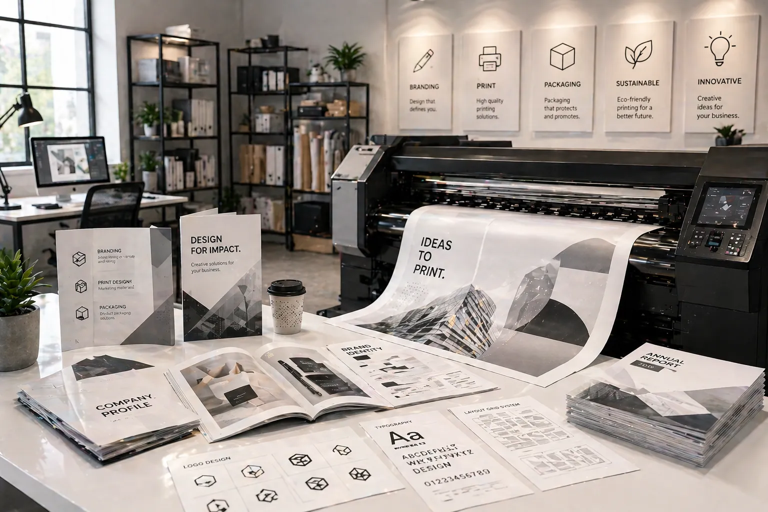
Most people think brochure design starts with a logo, a colour palette or a great photograph. It doesn't. It starts with a blank rectangle and the decision of how big that rectangle should be. Choose the right size and fold and your content has room to breathe, your message has structure, and your brochure actually gets read. Choose the wrong one and you're cramming text into panels that were never meant to hold it or handing someone a limp A3 sheet at a trade fair that immediately folds in on itself. Size is not a detail. It's the foundation.
01 Why Size Matters More Than You Think
Here's something designers know that most clients don't: the size of your brochure shapes how people interact with it before they've read a single word. A small, compact folded brochure feels personal and approachable. A large, flat format feels authoritative and premium. A gate fold feels like an event, something to be opened, discovered, and experienced.
Brochure design and layout is also dictated by size. A trifold brochure naturally breaks your message into six panels, which forces clarity and prioritisation. A larger format gives you room to tell a longer story, but it also demands better design discipline to avoid feeling empty or overwhelming. The size you choose is not just a practical decision. It's a creative one.
And then there's the practical side: how will this brochure be distributed? Handed out at a counter? Mailed in an envelope? Displayed in a rack? Carried in a jacket pocket? Each scenario calls for a different size. A brochure that can't be posted without being folded again, or that falls out of a display stand, or that won't fit in a handbag is a brochure that doesn't get to where it needs to go.
Start Here Before You Design Anything
Before you open a design tool or write a single line of copy, answer these three questions. How will this brochure be distributed? How much content does it actually need to hold? And what impression do you want someone to have the moment they pick it up? Those three answers will point you directly to the right size and format every time.
02 The Standard Brochure Sizes — And What Each One Does
There are really only a handful of standard brochure sizes that see regular use in commercial print. Each has its own character, its own strengths and the right home in a well-considered print marketing strategy. Here's an honest breakdown of each.
A4 — The Workhorse 210 × 297 mm · Most widely used format
A4 is the brochure paper size most people default to and for good reason. It's universally understood, easy to file, fits in a standard envelope and gives you enough real estate to tell a proper story. A flat A4 works beautifully as a product sheet or service overview. Folded in half, it becomes an A5 booklet. Folded in thirds, it becomes the classic trifold.
Best for: Corporate profiles, service brochures, product sheets, event programmes, menus are anything that needs to live in a folder or be posted.
A5 — The Compact One 148 × 210 mm · Half of A4
A5 is the sweet spot between a flyer and a full brochure. It's light, easy to carry and sits comfortably in a jacket pocket or handbag. For businesses that need something more substantial than a flyer but more portable than a full brochure, A5 is often the perfect middle ground. It prints economically and works well for short-form content, think a four-page folded booklet or a simple two-sided product card.
Best for: Cafés, salons, retail, events, real estate listings, product summaries are anywhere portability matters.
A3 — The Statement Piece 297 × 420 mm · Double A4
A3 is the format you choose when you want your brochure to make a visual impact the moment someone opens it. Folded once, it becomes an A4 booklet with four generous panels. Flat, it functions more like a poster-brochure hybrid, useful for product showcases, architectural plans, maps or any content that benefits from scale. It's also a common format for high-end catalogues and lookbooks where imagery is the hero.
Best for: Architecture, interior design, luxury products, photography, annual reports, portfolios, large-scale product showcases.
DL — The Mailing Format 99 × 210 mm · Fits a standard DL envelope
DL is the format designed to be mailed. Its brochure dimensions match a standard DL envelope exactly, which makes it the go-to for direct mail campaigns, appointment cards, event invitations and any brochure that needs to land on someone's desk without being folded again. It's narrow and tall, which forces a clean, editorial layout and when designed well, it feels considered and intentional rather than constrained.
Best for: Direct mail, event invitations, appointment reminders, promotional inserts anything that needs to be posted without re-folding.
03 Folds That Change Everything — Choosing the Right One
The size of the paper is only half the decision. The fold determines how your content is revealed, how many panels you have to work with and how the brochure feels in someone's hands. Some brochure fold types are practical workhorses. Others are genuinely theatrical, they create a moment when opened. Here are the ones worth knowing.
The Trifold — The Classic
The trifold brochure is the format most people picture when they hear the word "brochure." An A4 sheet folded into three equal panels gives you six content sections are front cover, back panel and four interior panels. It fits perfectly into a DL envelope, sits flat in a display rack and is immediately intuitive to open and read. For service businesses, product overviews or any situation where a clear, structured format serves you well, the trifold brochure is almost always the right call.
The Bi-fold — Room to Breathe
A single fold down the centre gives you four panels such as front cover, back cover and two large interior spreads. The bi-fold format offers more space per panel than a trifold, which makes it ideal for content that benefits from generous white space, large photography or a more premium, editorial feel. It's the format of choice for boutique hotels, architecture firms, luxury brands and anyone whose content needs room to be felt rather than just read.
The Z-fold — The Storyteller
The Z-fold (sometimes called an accordion fold) opens in a zigzag pattern, which means each panel is revealed progressively. This makes it uniquely suited to content that has a natural sequence like a step-by-step process, a journey, a timeline or a comparison. Unlike a trifold, which tucks one panel inside the other, the Z-fold opens like a map, extending into a long horizontal strip. It also stands upright on its own, which gives it an interesting display function at trade fairs and retail counters.
The Gate Fold — The Occasion Format
Two outer panels that open like doors to reveal a large interior spread. The gate fold is the most theatrical of the standard brochure fold types, it creates genuine anticipation. When opened, it delivers a moment: a stunning full-width image, a big announcement, a product reveal or a visual story that simply couldn't live in a more compact format. Gate fold brochures cost slightly more to produce because of the additional precision required in folding, but the impression they make is worth the investment for the right occasion.
04 Brochure vs Flyer — Knowing Which One You Actually Need
The flyer vs brochure question comes up more often than you'd expect. And the honest answer is that they serve fundamentally different purposes and confusing the two leads to a lot of badly executed print marketing materials.
A flyer is a single sheet that is flat, unfolded, designed to communicate one message quickly. It's built for speed: a sale, an event, a promotion, a call to action. You read it in fifteen seconds and either act on it or you don't. A flyer is broadcast media in print form.
A brochure is a considered piece. It has structure, sections and a deliberate sequence. It invites someone to spend time with your brand, to understand what you do, to arrive at a decision. A brochure is a conversation in print form it asks something of the reader and rewards them for engaging.
| Factor | Brochure | Flyer |
|---|---|---|
| Purpose | Build understanding, credibility, consideration | Create immediate awareness or response |
| Content depth | Multiple sections, layered information | One message, one call to action |
| Format | Folded, multi-panel, sometimes booklet | Single sheet, flat or one simple fold |
| Reading time | 2–5 minutes | 15–30 seconds |
| Best used for | Service overviews, product ranges, company profiles | Events, offers, promotions, local awareness |
| Shelf life | Long — kept for reference | Short — immediate response or discard |
| Print cost | Higher — folding, more panels, better stock | Lower — simple format, economical to produce |
Real Talk
If someone asks you what your business does and you hand them a flyer, you're leaving them with a question mark. If you hand them a well-designed brochure, you're handing them an answer. Use the right tool for the right moment and if you're trying to decide between the two in the flyer vs brochure debate, ask yourself: do I need someone to act right now, or do I need them to understand and trust me first?
05 Matching Size to Your Business and Purpose
There's no universally correct brochure size. There's only the right size for your specific business, your specific audience and what you're trying to achieve. This brochure size guide will help you match format to purpose.
When to choose a trifold:
- You have a clear, structured service or product range to present.
- The brochure will live in a display rack, at a counter or be mailed in an envelope.
- Your audience will scan it quickly rather than read it cover to cover.
- Budget is a consideration; trifolds are economical to print and fold.
When to choose a bi-fold:
- Your content benefits from larger panel sizes are portfolios, photography, architecture.
- You want a more premium, unhurried reading experience.
- The brochure will be handed directly to a prospect in a meeting or consultation.
- Brand positioning is high-end and the format needs to reflect that.
When to choose a gate fold:
- You're launching a product, announcing something significant or creating an event invitation.
- The interior of the brochure contains a hero image or spread that deserves to be revealed.
- Your audience expects a premium experience and your budget supports it.
- This brochure is a centrepiece of your marketing collateral, not a routine leave-behind.
When to choose DL format:
- The brochure needs to be posted in a standard envelope without additional folding.
- It will be used as a direct mail piece or event insert.
- Your content is concise and benefits from a clean, editorial, narrow format.
06 A Few Things to Check Before You Go to Print
Choosing the right size and fold is the big decision. But there are a few smaller ones that sit just beneath it, and getting them wrong at this stage is the kind of thing that only becomes visible once the brochure is in your hands and it's too late to change.
Paper weight matters as much as size
A beautifully designed trifold printed on flimsy 80 GSM paper feels cheap the moment someone picks it up. For most print marketing materials, 130–170 GSM coated stock is the baseline for a professional feel. For a bi-fold or gatefold brochure where the cover takes more handling, 250–300 GSM on the outer panels is worth considering. The paperweight should match the impression you want to create, not just the budget you want to hit.
Account for bleed and fold tolerance in your design
When designing for print, every element needs to account for bleed typically 3mm on all edges, so that trimming doesn't leave white borders at the edges. For folded formats, the panels that fold inward need to be designed fractionally narrower to allow the paper to fold cleanly without buckling. This is where working with experienced brochure design services saves you from discovering these issues at the press stage.
Consider the finish
Matte lamination gives a sophisticated, tactile feel. Gloss enhances photography and makes colours pop. Soft-touch laminate is the premium option, it feels almost like fabric and creates an immediate sensory impression. The finish you choose should complement the brochure design and layout and the brand it represents. A luxury product deserves a luxury finish. A straightforward service brochure might not need more than a quality uncoated stock.
Before You Send to Print
Always request a physical proof or a folded dummy before approving a full print run. A flat PDF proof on screen does not tell you how the panels will feel in hand, whether the fold lines sit correctly or whether your images bleed correctly to the edge. One afternoon with a printed dummy saves you from reprinting an entire run. If you're working with brochure printing services in Chennai, most reputable suppliers will offer this as standard.
“Your brand deserves to be felt, not just seen. Make sure your layout has structural room to breathe.”
The Right Size Is the One That Serves the Story
Brochure size is not a technical afterthought. It's a creative decision that shapes everything that follows, how much content you can include, how the design breathes, how someone interacts with the piece and what impression they're left with when they put it down.
Start with your purpose. Match the format to how the brochure will live in the world. Let the fold work with your content structure, not against it. And choose a paper weight and finish that reflects the brand it represents, not just the minimum that fits the budget.
A brochure that's the right size, printed well and designed with intention is one of the most effective print marketing materials you can put in a potential customer's hands. It works when you're not in the room. It speaks for your brand before you've said a word. That's worth getting right.
Choose the size that fits the story you're trying to tell and then tell it well.
Frequently Asked Questions
For most of my campaigns, you should use A4 or A5. Understanding standard brochure sizes helps you pick the right format based on how much content you need to include.
Prefer the trifold for service brochures. The trifold brochure format organises information into three clean sections that guide the reader naturally from intro to offer to contact.
A flyer vs a brochure comes down to depth. You should use flyers for quick announcements and brochures when you need to tell a fuller brand story that builds credibility.
Print Monster offers reliable brochure printing services in Chennai with multiple size, fold and paper finish options that suit both small batches and large campaign runs.
Your brochure design and layout choices always follow the fold type. You should plan the content flow first, then choose the size and fold that makes the information easiest to read.